UNIVERSITIES OF WISCONSIN ONLINE WEBSITE
Project Link: University of Wisconsin Online
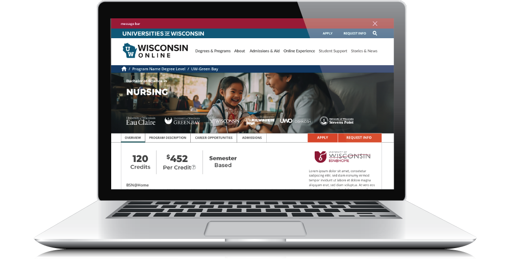
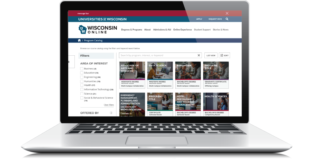
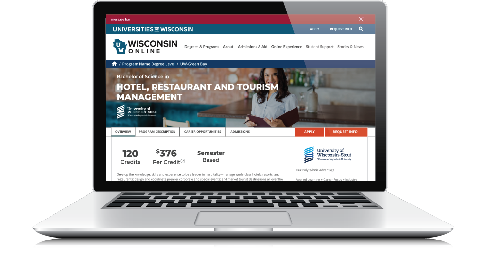
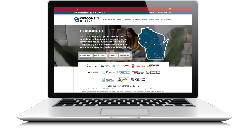
For the University of Wisconsin’s online education platform, I collaborated closely with the executive team to conceptualize and design a website that meets the needs of prospective students, faculty, and staff.
Categories
UX/UI
Art Direction
Branding
Online Content Creation
Skills
Adobe Experience Design
Adobe Photoshop
Adobe Illustrator
Figma
This project involved:
- Strategic Concept Development: I participated in brainstorming sessions with the executive team to align on the core goals, audience needs, and functional priorities of the website. Together, we crafted a vision to create a user-centered platform that is informative, intuitive, and engaging.
- User Experience Design: I designed a comprehensive user experience, focusing on accessibility and ease of navigation. From the homepage to program-specific pages, I developed a layout that facilitates clear paths for users to explore programs, understand enrollment steps, and engage with resources.
- Wireframes and Interactive Prototyping: I built detailed wireframes to map out content structure, interactions, and flow. These prototypes were key for aligning the team and conducting usability testing, ensuring that each user interaction was optimized for both desktop and mobile experiences.
This project allowed me to apply a user-first approach to an educational platform, resulting in a functional, streamlined, and visually engaging website that supports the University’s mission to make online education more accessible.

